Infrastructure Dashboards: Turning Telemetry Into a Picture You Can Act On
Modern IT generates a staggering volume of telemetry.
- Content owner
- Insyto Content Team
- Editorial reviewer
- Ritesh Mhatre
- Technical reviewer
- Navish Ansari
- Next review
- To be scheduled
- Last reviewed
- Review pending
- Technical level
- Intermediate · IT operations leaders, platform engineers
Executive Summary
Modern IT generates a staggering volume of telemetry. Every server, network device, database, cloud service, backup job, and endpoint agent emits metrics, logs, and events around the clock. That data is only valuable if a person can make sense of it quickly, and no one can do that by flipping between ten different tool screens while an incident unfolds. An infrastructure dashboard is the answer: it collects the signals that matter from across the estate and presents them as one clear picture of health that can be read at a glance. It turns a wall of raw numbers into a single pane of glass, so that a problem is visible in seconds rather than discovered after switching tabs — or worse, after a user reports it.
The value of a dashboard is not in showing everything; it is in showing the right things, clearly. A cluttered screen crammed with dozens of gauges and raw counters is nearly as useless as no dashboard at all, because the eye has nowhere to land and “bad” looks the same as “fine.” The best dashboards are disciplined: a handful of well-chosen panels, ordered by importance, colored against thresholds, and paired with trends and baselines so that every number carries meaning. Achieving this is less a technical problem than a design one. It starts not with the data available but with the audience and the questions they need answered.
This vendor-neutral guide sets out how to build infrastructure dashboards that people actually use. It explains why the single pane of glass matters, describes a three-tier dashboard hierarchy that serves executives, operators, and engineers differently, breaks down the anatomy of a panel that genuinely helps, and lays out an audience-first, iterative build process. It closes with the practices, mistakes, and metrics that separate a dashboard read in two seconds from one everybody quietly ignores. The throughline is simple: a dashboard exists to answer a question at a glance — and anything on it that does not serve that goal is noise.
From Scattered Data to a Single Pane of Glass
Before designing dashboards, it helps to be clear about the problem they solve. IT telemetry is naturally siloed — each tool has its own console — and that fragmentation is precisely what makes incidents slow to spot.
From scattered data to a single pane of glass
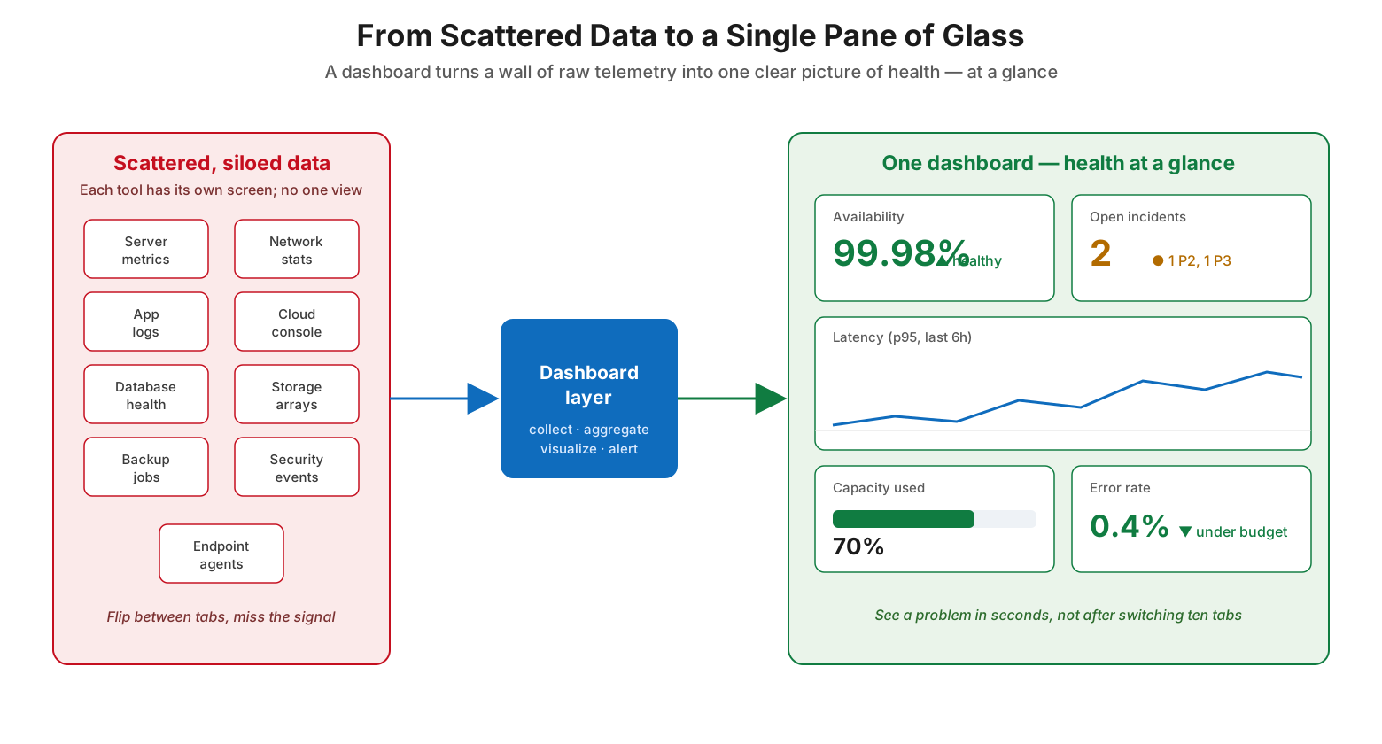
On one side sits the reality of most environments: server metrics in one tool, network stats in another, application logs, the cloud console, database health, storage arrays, backup jobs, security events, and endpoint agents each behind their own screen. To understand overall health, someone has to flip between tabs and hold the picture together in their head — and in that flipping, the signal gets missed. A dashboard layer sits in the middle, collecting from those sources, aggregating and correlating the data, and visualizing it in one place. The result on the other side is a single dashboard where availability, open incidents, latency trends, capacity, and error rate all appear together. The payoff is speed: a problem is seen in seconds, at a glance, instead of after switching ten tabs or waiting for a complaint. That “single pane of glass” is the whole point — one view that answers “is everything OK?” without a scavenger hunt across tools.
The Dashboard Hierarchy: Three Tiers, Three Audiences
A common mistake is trying to make one dashboard serve everyone. It cannot, because different people need to answer very different questions at very different depths. The solution is a layered set of dashboards, each pitched at its audience, with the ability to drill from one level to the next.
The dashboard hierarchy — three tiers, three audiences
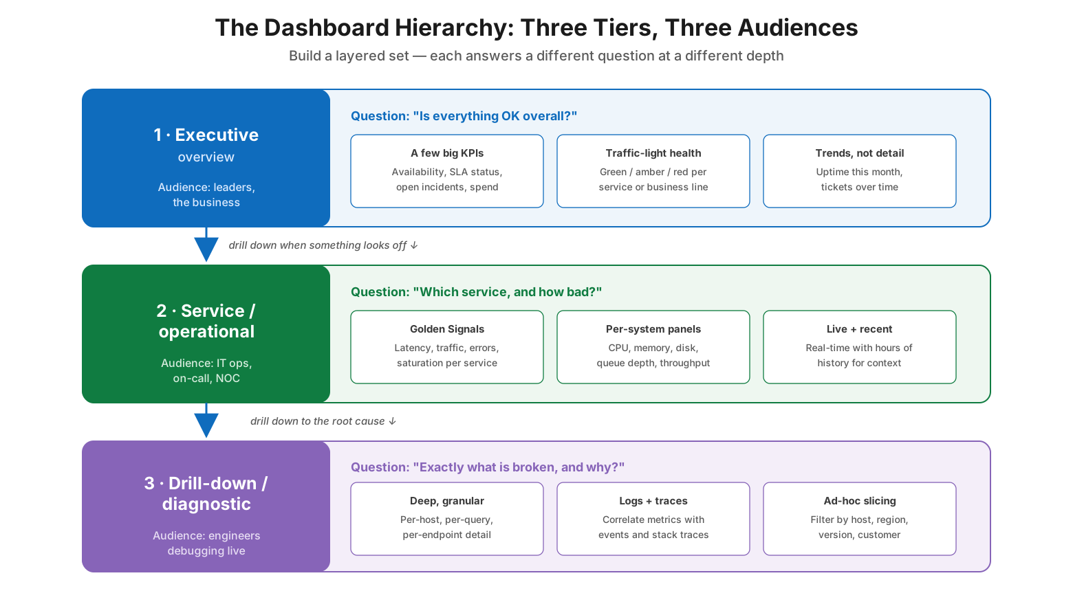
The top tier is the executive or overview dashboard. Its audience is leaders and the business, and its question is simply “is everything OK overall?” It shows a few big KPIs — availability, SLA status, open incidents, spend — with traffic-light health per service or business line and trends rather than detail. The middle tier is the service or operational dashboard, used by IT operations, on-call staff, and the NOC. Its question is “which service, and how bad?” It shows the Golden Signals (latency, traffic, errors, saturation) per service, per-system panels for CPU, memory, disk, and throughput, and live data with enough recent history for context. The bottom tier is the drill-down or diagnostic dashboard, used by engineers debugging live. Its question is “exactly what is broken, and why?” It offers deep, granular per-host and per-query detail, logs and traces correlated with metrics, and ad-hoc slicing by host, region, version, or customer. The tiers connect: an amber light on the executive view leads down to the service view, which leads down to diagnostics. Each layer answers its own question and hands off cleanly to the next.
| Tier | Audience | Question it answers | What it shows |
|---|---|---|---|
| Executive / overview | Leaders, the business | “Is everything OK overall?” | A few big KPIs, traffic-light health, trends |
| Service / operational | IT ops, on-call, NOC | “Which service, and how bad?” | Golden Signals, per-system panels, live + recent history |
| Drill-down / diagnostic | Engineers debugging live | “Exactly what is broken, and why?” | Granular detail, logs and traces, ad-hoc slicing |
Anatomy of a Dashboard That Actually Helps
Within any tier, whether a dashboard helps or hinders comes down to the design of its panels. A useful dashboard is not defined by how much it shows but by how fast it answers a question. Several elements make the difference.
Anatomy of a dashboard that actually helps
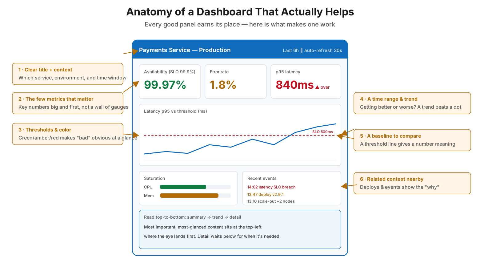
A dashboard that works has a clear title and context so the viewer knows which service, environment, and time window they are looking at. It surfaces the few metrics that matter as big, prominent numbers rather than burying them in a wall of identical gauges. It uses thresholds and color — green, amber, red — so that “bad” is instantly obvious without reading a single digit. It provides a time range and trend, because a number is far more meaningful when you can see whether it is getting better or worse. It gives each metric a baseline to compare against, such as an SLO or threshold line, since a value without a “versus what” is hard to interpret. And it places related context nearby — deploys, events, and annotations beside the metrics — so a responder can spot the “why” behind a change. Finally, it is laid out to be read top-to-bottom and left-to-right: the most important, most-glanced content sits at the top-left where the eye lands first, with summary at the top, trends in the middle, and detail waiting below for when it is needed.
| Element | What it provides | Why it matters |
|---|---|---|
| Clear title & context | Service, environment, time window | Viewer knows what they’re looking at |
| Few key metrics, prominent | Big numbers for what matters | Eye finds the signal instantly |
| Thresholds & color | Green / amber / red states | “Bad” is obvious without reading digits |
| Time range & trend | Direction over time | Shows better-or-worse, not a lone dot |
| Baseline to compare | SLO or threshold line | Gives each number a “versus what” |
| Related context nearby | Deploys, events, annotations | Reveals the “why” behind a change |
How to Build a Dashboard: Start With the Audience, Not the Data
The strongest predictor of a bad dashboard is that it was built data-first — someone took whatever metrics the tool exposed and put them all on a screen. Good dashboards are built the other way around, starting from the people who will use them and working toward the data.
How to build a dashboard — start with the audience, not the data
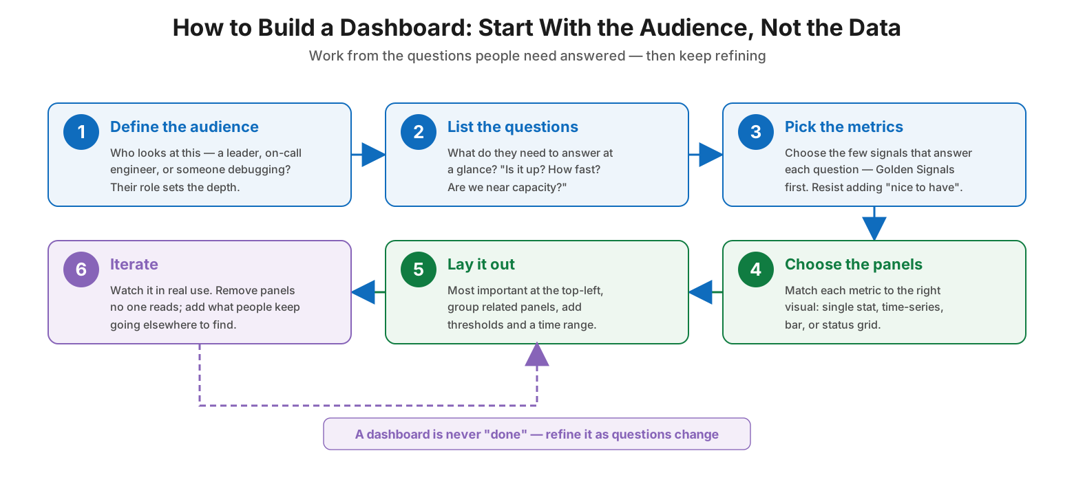
The process has six steps. First, define the audience: who looks at this — a leader, an on-call engineer, or someone debugging — because their role sets the appropriate depth. Second, list the questions they need to answer at a glance, such as “is it up?”, “how fast is it?”, and “are we near capacity?” Third, pick the metrics: choose the few signals that answer each question, leading with the Golden Signals and resisting the urge to add “nice to have” numbers. Fourth, choose the panels, matching each metric to the right visual — a single stat for a KPI, a time-series for a trend, a bar chart for comparison, a status grid for health. Fifth, lay it out, putting the most important panel at the top-left, grouping related panels, and adding thresholds and a time range. Sixth, iterate: watch the dashboard in real use, remove panels no one reads, and add whatever people keep leaving the dashboard to find elsewhere. That last step is a loop, not an endpoint — a dashboard is never truly “done,” because the questions worth asking change as the environment does.
| Step | What you do | Why it matters |
|---|---|---|
| 1. Define the audience | Identify who reads it and their role | Sets the right depth and detail |
| 2. List the questions | Write the questions they answer at a glance | Keeps the dashboard purposeful |
| 3. Pick the metrics | Choose the few signals per question | Prevents clutter and vanity metrics |
| 4. Choose the panels | Match each metric to the right visual | Makes each number easy to read |
| 5. Lay it out | Most important top-left; add thresholds | Guides the eye and shows priority |
| 6. Iterate | Prune unused panels, add missing ones | Keeps the dashboard relevant over time |
Infrastructure Dashboard Checklist
- Consolidate telemetry from all sources into a single pane of glass, not ten separate consoles.
- Build a layered set: an executive overview, service/operational views, and diagnostic drill-downs.
- Let each dashboard answer one clear question for one clear audience.
- Start from the audience and their questions, not from whatever data the tools expose.
- Lead with the Golden Signals — latency, traffic, errors, saturation — per service.
- Show the few metrics that matter as big, prominent numbers; avoid a wall of gauges.
- Add thresholds and green/amber/red color so problems are obvious at a glance.
- Pair every metric with a trend and a baseline (SLO or threshold) for context.
- Place related events and deploys beside metrics to reveal the “why.”
- Put the most important panel at the top-left and read top-to-bottom.
- Enable drill-down from overview to service to diagnostic views.
- Review dashboards regularly: remove unused panels, add what people seek elsewhere.
Best Practices
The gap between a dashboard people rely on and one they ignore is visible the moment you put two side by side: the same estate, rendered as an unreadable wall of gauges on one hand and a focused, two-second read on the other.
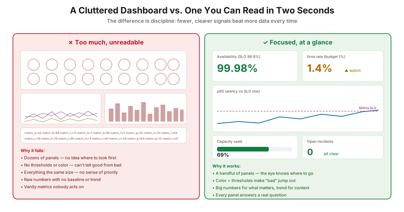
A cluttered dashboard versus one you can read in two seconds
Design for a question, not for the data. Every dashboard and every panel should exist to answer a specific question at a glance. If you cannot say what question a panel answers, it does not belong. This single discipline prevents most clutter.
Lead with the Golden Signals. For any service, latency, traffic, errors, and saturation give a fast, reliable read on health. Build the operational tier around them, and reserve deeper per-component metrics for the diagnostic drill-down.
Use color and thresholds ruthlessly. The value of a dashboard is being readable in two seconds, and color against thresholds is what makes that possible. Green, amber, and red let a viewer judge health without reading numbers at all.
Give every number context. A raw value is hard to act on; a value against a baseline and a trend is not. Always pair metrics with an SLO or threshold line and enough history to show direction.
Order by importance. Put the most important, most-glanced content at the top-left where the eye naturally lands, and arrange the rest summary-to-detail. Layout is a design decision, not an afterthought.
Prune relentlessly. Dashboards decay: panels get added and never removed, and the signal drowns. Review dashboards on a schedule, delete what no one reads, and add whatever people keep hunting for elsewhere.
Common Mistakes
Cramming everything onto one screen. A dashboard with dozens of panels and no hierarchy gives the eye nowhere to land. Fewer, well-chosen panels beat a comprehensive wall of data every time.
Building data-first. Putting up whatever metrics the tool happens to expose produces a dashboard full of numbers no one acts on. Start from the audience’s questions instead.
Omitting thresholds and color. Without green/amber/red, a viewer must read and interpret every value to judge health, which defeats the purpose of a dashboard. Encode “good” and “bad” visually.
Showing numbers without context. A metric with no baseline or trend leaves viewers unable to tell whether it is a problem. Always give a “versus what” and a direction.
One dashboard for every audience. A single screen cannot serve a CEO, an on-call engineer, and a debugging developer at once. Build a tiered hierarchy that drills from overview to detail.
Never revisiting dashboards. Treating a dashboard as finished lets it fill with stale, unused panels over time. Prune and refine it as the environment and its questions evolve.
Frequently Asked Questions
What is an infrastructure dashboard? It is a single, consolidated view that collects the key metrics, logs, and events from across your infrastructure — servers, network, databases, cloud, backups, security — and visualizes them together so you can understand health at a glance instead of checking many separate tools.
Why not just use the dashboards built into each monitoring tool? Per-tool dashboards keep data siloed, forcing responders to flip between consoles and assemble the picture in their heads. A consolidated dashboard is what lets a problem be spotted in seconds, especially during an incident when speed matters most.
How many dashboards should we have? Rather than one dashboard for everything, build a small hierarchy: an executive overview, one operational dashboard per major service or team, and diagnostic drill-downs for engineers. Each answers a different question at a different depth and links to the next.
What should go on an operational dashboard? Lead with the Golden Signals — latency, traffic, errors, and saturation — for each service, plus the key per-system metrics (CPU, memory, disk, throughput), shown live with enough recent history for context and with thresholds and color to make problems obvious.
How do we avoid cluttered, unreadable dashboards? Start from the questions the audience needs answered and include only the metrics that answer them. Show the few numbers that matter prominently, use color and thresholds, give each metric a baseline and trend, and prune panels no one uses.
Should dashboards replace alerting? No — they are complementary. Alerts push a notification when something needs attention; dashboards let a person investigate and understand context. Use alerts to know when to look, and dashboards to see what is going on when you do.
Conclusion
An infrastructure dashboard is the difference between drowning in telemetry and understanding it. The raw data exists whether or not anyone can act on it; the dashboard is what turns that flood into a single, readable picture of health — one that reveals a problem in seconds instead of after a scramble across tools or a call from a frustrated user. But the value comes entirely from discipline. A screen crammed with every available metric is barely more useful than no dashboard at all, because it hides the signal it was meant to surface.
The dashboards that earn their place are built deliberately. They are layered into a hierarchy that serves executives, operators, and engineers with the right depth for each. Their panels are designed to answer a question at a glance, with prominent key numbers, color against thresholds, trends, baselines, and nearby context. And they are built audience-first and refined continuously, because the questions worth answering shift as the environment grows. Hold to the one governing idea — that everything on a dashboard should help someone answer a question quickly, and anything that does not is noise — and the result is a single pane of glass that a team actually trusts and uses.
References
- Google SRE Book — Monitoring Distributed Systems (the Four Golden Signals)
- Google SRE Workbook — Monitoring
- Google SRE Book — Service Level Objectives
- Grafana — Best practices for creating dashboards
- Grafana — Common observability visualizations and panels
- NIST SP 800-137 — Information Security Continuous Monitoring
- Brendan Gregg — The USE Method (saturation and utilization)
On this page
- Executive Summary
- From Scattered Data to a Single Pane of Glass
- The Dashboard Hierarchy: Three Tiers, Three Audiences
- Anatomy of a Dashboard That Actually Helps
- How to Build a Dashboard: Start With the Audience, Not the Data
- Infrastructure Dashboard Checklist
- Best Practices
- Common Mistakes
- Frequently Asked Questions
- Conclusion
- References